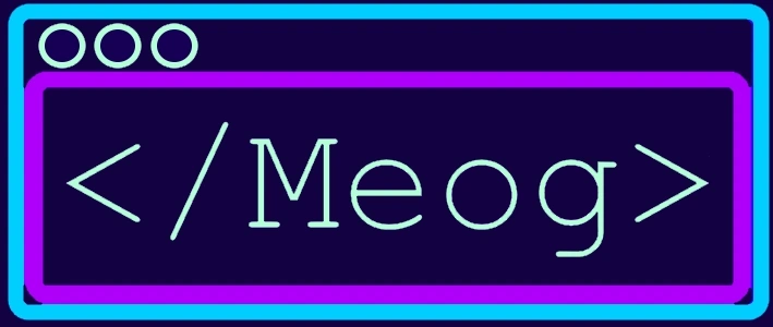
Greetings! Here we are! Instead of having:
Meog
as a "logo", we have... this!
There was some thought behind this logo. First of all:
- - Tried modifying the letters → too chaotic.
- - Three letters are round; the first is from my name → could be useful later.
- - Combine all letters into a single symbol → too hard to read.
- - Light bulb-cat (idea + mascot) → not convincing.
- - Light bulb with wires like a cat → looked like Wi-Fi + egg + lock, still too complex.
- - Remove whiskers and ears → only a lock in an egg with Wi-Fi symbol remains.
- - Focus on “meta” and dimensions → cube idea, but too abstract.
- - Focus on the website → final logo is a browser with "<Meog/>", a fake HTML tag.
The colors are cold neon to convey calm, tranquility, and a “tech” and “futuristic” feel. I really enjoy playing with lights.
I hope you like the logo that will be with us for a while! See you in the next post!